

Pixels in Motion:
Rethinking Real-Time Bus Displays
Client: Hanover (UK) – Hong Kong Team
Role: UI/UX Designer (Collaborating with Industrial & Software Engineers)
Project Timeline: 3 weeks (February- March 2025)
The Objective
Modernize the interface, improve passenger engagement, and enhance real-time travel information while staying on-brand.
Enhance the usability and information delivery of internal bus screens for daily commuters.
The Challenge
Hong Kong Citybus needed a modern, functional redesign of their internal bus screens—but with rigid constraints:
No user testing (3-week deadline)
Fixed 1920×540 landscape screens (no flexibility on specs)
Conflicting priorities: Passengers needed clarity; the business wanted ads and tourism promotions
My Role: Design a system that worked for both—without compromising usability.
Project Goals
Improve readability & engagement with a modern, clean UI.
Maximize space for additional valuable info (transfers, fares, tourism, flight times).
Maintain essential real-time data (current stop, next stops, ETA).
Introduce new features like QR codes for mobile access, CCTV baggage area footage, and tourism highlights.
How I delivered impact?
1. Rapid Alignment with Stakeholders
With no time for research, I:
✔ Audited existing screens to identify pain points (e.g., cluttered transfers, missed stops).
✔ Collaborated with industrial engineers to ensure the design fit hardware limits.
✔ Pitched two color variations (brand-compliant but optimized for readability).
2. Designing for Real-World Use Cases
The system had to work for:
Local commuters (transfer details, fare prices)
Tourists (attractions, airport info).
Drivers & operators (CCTV, real-time updates).
3. Smart Additions Within Constraints
I pushed for small but high-value features:
QR codes as a "safety net" for missed info (for those who prefer to use their personal device, those who cannot read the screen, etc.)
Dynamic ad spaces that don’t obscure critical alerts (ads disappear when more important info is prioritized)
Glanceable icons for tourists (e.g., luggage rules, attractions)
Existing internal screen on Citybus

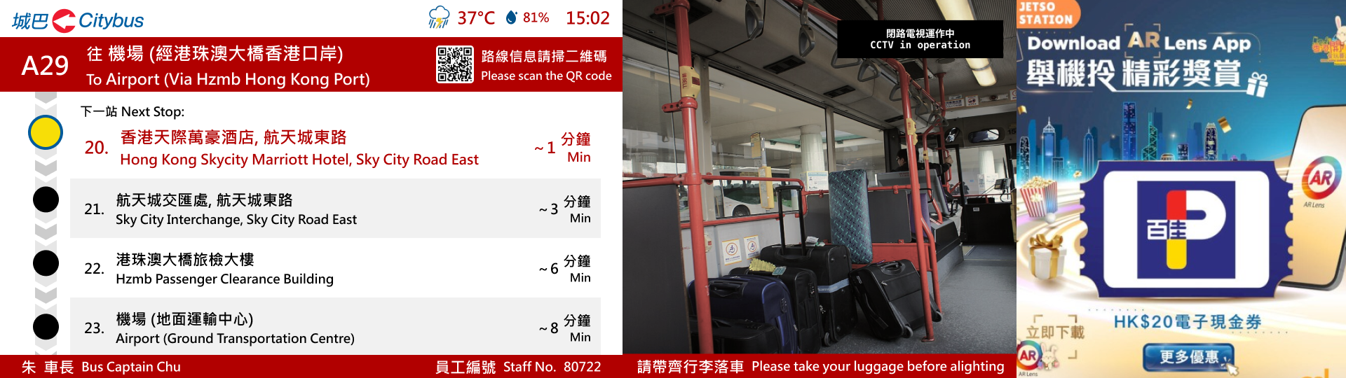
Reimagined design

Why This Project Highlights My UX Strengths?
1. I Thrive Under Constraints
No user testing? I leveraged existing pain points and stakeholder input
Fixed screen size? I prioritized hierarchy over cramming
Business demands ads? I designed non-intrusive placement.
2. I Design Systems, Not Just Screens
This wasn’t a one-size-fits-all solution. The two route prototypes show how the same system adapts to:
✔ High-frequency urban routes (info-dense, fast updates).
✔ Airport/tourist routes (leisure-focused, multilingual).
3. I Bridge Business & User Needs
The project succeeded because it:
✔ Provided additional info for commuters (transfer options, fare prices, key attractions)
✔ Met business goals (ad revenue, tourism partnerships)
✔ Pitched a new modern design to elevate the Citybus brand and technology

The Results
In 3 weeks, I delivered:
2 fully functional prototypes (commuter + airport routes)
2 brand-aligned color systems (tested for accessibility/ readability)
A flexible template for future routes
Explore interactive prototypes to see how the system adapts to different routes